I know you guys already answered this question a few months back, but since 2026 has started I do want to ask if you're working on the fangame still (or if I'm just holding out hope for something not coming.) Thank you guys!
Thanks for reaching out! We're absolutely still hard at work on this game and are actually working on another devlog post as we speak to update you all on the specifics of the progress we've made!
So stay tuned! And thanks so, so much for all your support!
i love this so much AAAAAAAAAAAAAA EXPLODES FROM HOW GREAT THIS GAME IS!!!!!!!!!!!!!!!!!!!!!11 I CANT WAIT FOR IT TO BE FINISHED!! I WILL WAIT YEARS IF NEEDED OMG I JUST LOVE THIS SO MUCH IM EXLODING!!!!!
this demo was so much fun!i love the sprites (fran and maya having matching scarves... trucy wearing her dad's hat... so cute...) and the UI is gorgeous. playing this with snow outside my window felt perfect hehe i'll be eagerly awaiting the full game! it's immediately clear how much everyone behind this project cares about these characters and this series which is what i love to see :) (btw i am sorry about the weird spacing this is my first time commenting on here i do not know what is up with that)
Franmaya!!! Yayy!!!! And also everything else is great, especially the art and the music! Love that you're going for your own version of AA style, rather than just trying to copy it. Extremely looking forward to full game!!!
This is super fun to play and the characters feel just right too, it doesn't feel OOC or anything! I'm intrigued to play more and figure out the mystery since the demo doesn't cover so far for me to start forming a theory yet which isn't a bad thing, just an observation lol
I love the art and music too! It'll be great if the music was posted for streaming, something I've always loved with Ace Attorney is when the music is rearranged for the next entry or for a different character's POV so it's exciting to hear them with a new spin again.
The only things which pulled me out of it sometimes were the sound effects when your cursor passes over anything, I think a sound effect only when you actually click the button would be preferable buuut that's probably more a skill issue on my part for being picky with noises since I have misophonia and get easily miffed with repetitive noises. When the full game comes out I might just toggle with the SFX volume to lower the volume instead. The other thing which pulled me out was the background images felt really bright but that could be a fault with my screen so neither of these are deal breakers in any sense! It was just a little jarring going from black screens to bright hallways but the CG an sprite arts felt fine, it was just the background which threw me off just a lil bit.
I feel like I criticized more than complimented but I really did enjoy playing it a lot!! I'm super excited! :D Best of luck to and thank you to the whole team!!! <3 <3 <3
Unfortunately, an APK file wouldn't be feasible as the UI, layout, and gameplay aren't tailored to smartphone utility. We apologize for the inconvenience!
I just played through the demo, thought it was pretty good overall. I think the sprites (which are very cute) along with the winter aesthetic are probably the demo's strongest point overall. Beyond that I also thought Trucy in particular was written well. I'm only about midway through AA5 myself, but her characterization here seems closer to the more complex character hinted at for her in AA4, than what I've seen of her in 5. Beyond just her characterization I also liked the concept of seeing a character knowing of and trying to work against the Magnatama. I also enjoyed the full dialog for all presents.
As for some constructive criticism, as another commenter said, I think the contrast on the backgrounds is bit blown out, particularly the hallway and stage. I found it a bit odd that we didn't actually see the interaction where Maya gives the Magnatama to Fran, which feels like it'd be kind of an important moment, though I suspect that may be planned to be included in the full release. Only other thing I could think of is maybe a little more set up/establishment for Maya and Franz relationship since we otherwise have no context for it. Though tbf the implicit set up is fairly clear, so it might not be necessary idk.
J'ai joué à la démo de ce super fangame hier soir avec mes amis, et qu'est-ce qu'on s'est amusés! Au lieu d'une heure, on y a passé 4 heures, à piailler, à tout interpréter, à apprécier les dessins, et c'était si bien! J'ai passé un super moment dessus, hâte de jouer à la version complète!
Just finished playing the Echoes of a Turnabout: Franziska von Karma demo - I am really looking forward for the finished game next year! Characters are cute and appealing, music itself blends well with the art style. I look forward to how Franziska's story grow. My only small complaint is the contrast of the backgrounds - they are bit too bright, that I had to dim down my monitor's brightness (image below)
Besides that, I am very pleased with the demo. If there is a donation I can make, please let me know, because I'd love to support the work you guys have put in
P.S Thank you for making me LOL when Maya tried to describe a Thunderbolt port. Gotta call them Thunderclaps from now on
Thanks so much for this feedback! We're taking that into account as we move forward with the full game. We're glad you've enjoyed our demo and hope you enjoy the full game on its release! 💥
Wow, I'm impressed! It was so nice to see old characters returning and being accurately characterized (especially Trucy, big shoutout to whoever wrote her!). I never really understood Franmaya as a ship but this might have just opened my eyes because they were a great contrast to each other, definitely enjoyed their dynamic! This small exchange in particular sold me on them, it really sticked with me.
Yeah, this feels really promising. Interesting mystery, great fanservice, a sweet style and setting (I looove everyone's winter clothes). This is just a big love letter to Ace Attorney fans. Thank you all for letting me test out the demo, I will be there for the final product!
Thank you, so so much! We're so honored to be able to open your eyes to Franmaya and are so happy that you've enjoyed the demo! We hope you enjoy the full game once it's released! 💥
What a brilliant demo! I enjoyed it immensely. The dialogue was in character, the music was a sweet little homage, and I seriously cried seeing some of my faves again, especially in this part of the AA timeline. I'm a huge AA fan and adore AA fan content, so this was delightful demo that had me thrilled to play and excited for more. Can't wait!!!
Does this include the typical white full screen flash effect AA games has? If so, is there an option to turn it off? Sorry I just get really bad photosensitive migraines from those effects. Thank you.
Hi! Just confirming what the other commenter said that white flashes can indeed be turned off in the Options menu. At the moment this option disables screenshake and flashes, and also disables some other animations such as dissolves (while leaving in others), but in the full game we intend to offer more granular options so you're able to turn off just the animations that will trigger you and still experience the rest. Thanks for checking out our demo!
I wanted to add to what a previous comment here said- I also find the text boxes to be quite a bit larger than necessary, even accounting for the accessibility size changing/accuracy to ported games. Most casual players won't know about hitting "H" to hide it. I recommend just shortening it a bit, because it detracts from the otherwise really lovely aesthetics of the game! It's okay if the text box isn't exactly the same dimensions because the art style isn't identical, either.
The music is great, the dialogue is funny and on-point. I really love the whole concept for this game, as someone who always wanted to play as Franziska. Really excited for the full version!
I really like this!! The writing is charming and funny, the music rocks, the art is ADORABLE and well-made, this is like, a 9.9/10 for me at this moment and I can’t wait for the full to come out!
The only 0.1 “flaw” I myself could see on this is perhaps the textbox UI could be smaller? I realize that like, 99% of the dialogue takes only 3 lines of text (and the small amount of dialogues that don’t is for like, a single word or two where a small rewrite could easily make it fit three lines), yet the message box is way taller than that, which leaves a lot of the screen covered that could’ve been freed by just reducing the size of the message box.
I’m so sorry my super small nitpick (that isn’t even THAT important at all. it doesn’t affect the quality nearly enough for it to be remarkable) ended up being longer than my praise for this; it was just longer and harder to explain, but rest assured it’s very unimportant and even if that isn’t changed I’m looking forward to this project ^^u
We really appreciate your feedback! (and the rest was heard loud and clear, we are really glad you enjoyed the demo so far!) The textbox UI is shaped the way it is as a deliberate mimic of the mainline Ace Attorney Steam/console ports (it is in fact the exact same dimensions). Quite honestly I agree that it takes up too much space, haha, but we thought it appropriate to use our UI to evoke an experience as close to the original games as possible, with some extra Franziska flair. (The extra space also allows a little wiggle room for those using the accessibility features to increase font size without it clipping out of bounds). If you'd ever like to see more of the screen in certain situations, you can always temporarily hide the dialogue window with the H key!
Ooooh okay that makes a lot of sense then!! that 0.1 “flaw” has been erased then haha, sorry for the uninformed “critique” ^^u
I didn’t know the logic for it, and it all makes plenty of sense yeah.
I also thought the UI for the trilogy took too much screen space originally but didn’t even realize this was replicating THAT as well, nor did I notice there were accessibility options like so.
I definitely am on the side of accessibility myself as well, just didn’t realize this UI could help with that!
← Return to fangame
Comments
Log in with itch.io to leave a comment.
I know you guys already answered this question a few months back, but since 2026 has started I do want to ask if you're working on the fangame still (or if I'm just holding out hope for something not coming.) Thank you guys!
Hi there! So sorry for the delay in responding!
Thanks for reaching out! We're absolutely still hard at work on this game and are actually working on another devlog post as we speak to update you all on the specifics of the progress we've made!
So stay tuned! And thanks so, so much for all your support!
AWESOME!! I'm SO excited for this game!! :D
oh really! I can't wait! Hope your holidays went well and I'm watching this project with great anticipation!
is this still being worked on?
Hi there!
We’re absolutely still working on this project! If you’d like to see our progress, you can check out our devlog to see our most recent update! 💥
i love this so much
aaaah, loved the demo! can't wait for full game
i love this so much AAAAAAAAAAAAAA EXPLODES FROM HOW GREAT THIS GAME IS!!!!!!!!!!!!!!!!!!!!!11 I CANT WAIT FOR IT TO BE FINISHED!! I WILL WAIT YEARS IF NEEDED OMG I JUST LOVE THIS SO MUCH IM EXLODING!!!!!
this demo was so much fun!i love the sprites (fran and maya having matching scarves... trucy wearing her dad's hat... so cute...) and the UI is gorgeous. playing this with snow outside my window felt perfect hehe i'll be eagerly awaiting the full game! it's immediately clear how much everyone behind this project cares about these characters and this series which is what i love to see :) (btw i am sorry about the weird spacing this is my first time commenting on here i do not know what is up with that)
Franmaya!!! Yayy!!!! And also everything else is great, especially the art and the music! Love that you're going for your own version of AA style, rather than just trying to copy it. Extremely looking forward to full game!!!
This is super fun to play and the characters feel just right too, it doesn't feel OOC or anything! I'm intrigued to play more and figure out the mystery since the demo doesn't cover so far for me to start forming a theory yet which isn't a bad thing, just an observation lol
I love the art and music too! It'll be great if the music was posted for streaming, something I've always loved with Ace Attorney is when the music is rearranged for the next entry or for a different character's POV so it's exciting to hear them with a new spin again.
The only things which pulled me out of it sometimes were the sound effects when your cursor passes over anything, I think a sound effect only when you actually click the button would be preferable buuut that's probably more a skill issue on my part for being picky with noises since I have misophonia and get easily miffed with repetitive noises. When the full game comes out I might just toggle with the SFX volume to lower the volume instead. The other thing which pulled me out was the background images felt really bright but that could be a fault with my screen so neither of these are deal breakers in any sense! It was just a little jarring going from black screens to bright hallways but the CG an sprite arts felt fine, it was just the background which threw me off just a lil bit.
I feel like I criticized more than complimented but I really did enjoy playing it a lot!! I'm super excited! :D Best of luck to and thank you to the whole team!!! <3 <3 <3
Looking forward to the finished game! Unfortunate that it couldn't release on January but still excited for it regardless.
Hey, could you potentially make a APK file of this if possible if not, that's fine
Hi there!
Unfortunately, an APK file wouldn't be feasible as the UI, layout, and gameplay aren't tailored to smartphone utility. We apologize for the inconvenience!
But thanks for reaching out!
Oh, ok, that's quite alright, I'll just get it on my computer, thanks
I just played through the demo, thought it was pretty good overall. I think the sprites (which are very cute) along with the winter aesthetic are probably the demo's strongest point overall. Beyond that I also thought Trucy in particular was written well. I'm only about midway through AA5 myself, but her characterization here seems closer to the more complex character hinted at for her in AA4, than what I've seen of her in 5. Beyond just her characterization I also liked the concept of seeing a character knowing of and trying to work against the Magnatama. I also enjoyed the full dialog for all presents.
As for some constructive criticism, as another commenter said, I think the contrast on the backgrounds is bit blown out, particularly the hallway and stage. I found it a bit odd that we didn't actually see the interaction where Maya gives the Magnatama to Fran, which feels like it'd be kind of an important moment, though I suspect that may be planned to be included in the full release. Only other thing I could think of is maybe a little more set up/establishment for Maya and Franz relationship since we otherwise have no context for it. Though tbf the implicit set up is fairly clear, so it might not be necessary idk.
Absolutely adorable.
Thank you so much! 💥
Congrats on 1st place on Doujin Fest!
Thank you so much! And congratulations on 3rd place, too!
Thank you! much appreciated!
J'ai joué à la démo de ce super fangame hier soir avec mes amis, et qu'est-ce qu'on s'est amusés! Au lieu d'une heure, on y a passé 4 heures, à piailler, à tout interpréter, à apprécier les dessins, et c'était si bien! J'ai passé un super moment dessus, hâte de jouer à la version complète!
Merci beaucoup! Nous sommes très heureux que vous ayez apprécié la démo !
Just finished playing the Echoes of a Turnabout: Franziska von Karma demo - I am really looking forward for the finished game next year! Characters are cute and appealing, music itself blends well with the art style. I look forward to how Franziska's story grow. My only small complaint is the contrast of the backgrounds - they are bit too bright, that I had to dim down my monitor's brightness (image below)

Besides that, I am very pleased with the demo. If there is a donation I can make, please let me know, because I'd love to support the work you guys have put in
P.S Thank you for making me LOL when Maya tried to describe a Thunderbolt port. Gotta call them Thunderclaps from now on
Thanks so much for this feedback! We're taking that into account as we move forward with the full game. We're glad you've enjoyed our demo and hope you enjoy the full game on its release! 💥
Wow, I'm impressed!
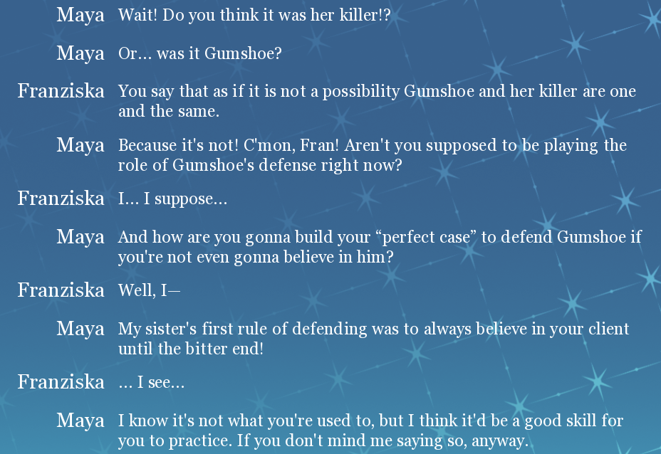
It was so nice to see old characters returning and being accurately characterized (especially Trucy, big shoutout to whoever wrote her!). I never really understood Franmaya as a ship but this might have just opened my eyes because they were a great contrast to each other, definitely enjoyed their dynamic! This small exchange in particular sold me on them, it really sticked with me.
Yeah, this feels really promising. Interesting mystery, great fanservice, a sweet style and setting (I looove everyone's winter clothes). This is just a big love letter to Ace Attorney fans. Thank you all for letting me test out the demo, I will be there for the final product!
Thank you, so so much! We're so honored to be able to open your eyes to Franmaya and are so happy that you've enjoyed the demo! We hope you enjoy the full game once it's released! 💥
What a brilliant demo! I enjoyed it immensely. The dialogue was in character, the music was a sweet little homage, and I seriously cried seeing some of my faves again, especially in this part of the AA timeline. I'm a huge AA fan and adore AA fan content, so this was delightful demo that had me thrilled to play and excited for more. Can't wait!!!
Thank you so much! We're SO glad to hear you enjoyed this demo! That means so much to us! 💥
Does this include the typical white full screen flash effect AA games has? If so, is there an option to turn it off? Sorry I just get really bad photosensitive migraines from those effects. Thank you.
Hi there! I just booted the game and it is available in the options menu.
thank you!
Hi! Just confirming what the other commenter said that white flashes can indeed be turned off in the Options menu.
At the moment this option disables screenshake and flashes, and also disables some other animations such as dissolves (while leaving in others), but in the full game we intend to offer more granular options so you're able to turn off just the animations that will trigger you and still experience the rest. Thanks for checking out our demo!
Super cute demo, really enjoyed it, can't wait for the full game!
Thank you so much! 💥
Awesome project, I love to see Attornies in a whole different world. I will love to be playing this on Xbox Series X consoles later on.
We're glad to hear you like our project! 💥
this seems super interesting, i love these characters 5ever. what point in the AA timeline is this around?
Hi there! Thanks for your interest! This case is set a few months after AA6! 💥
I wanted to add to what a previous comment here said- I also find the text boxes to be quite a bit larger than necessary, even accounting for the accessibility size changing/accuracy to ported games. Most casual players won't know about hitting "H" to hide it. I recommend just shortening it a bit, because it detracts from the otherwise really lovely aesthetics of the game! It's okay if the text box isn't exactly the same dimensions because the art style isn't identical, either.
The music is great, the dialogue is funny and on-point. I really love the whole concept for this game, as someone who always wanted to play as Franziska. Really excited for the full version!
I really like this!! The writing is charming and funny, the music rocks, the art is ADORABLE and well-made, this is like, a 9.9/10 for me at this moment and I can’t wait for the full to come out!
The only 0.1 “flaw” I myself could see on this is perhaps the textbox UI could be smaller? I realize that like, 99% of the dialogue takes only 3 lines of text (and the small amount of dialogues that don’t is for like, a single word or two where a small rewrite could easily make it fit three lines), yet the message box is way taller than that, which leaves a lot of the screen covered that could’ve been freed by just reducing the size of the message box.
I’m so sorry my super small nitpick (that isn’t even THAT important at all. it doesn’t affect the quality nearly enough for it to be remarkable) ended up being longer than my praise for this; it was just longer and harder to explain, but rest assured it’s very unimportant and even if that isn’t changed I’m looking forward to this project ^^u
Hello, UI designer here! 👋
We really appreciate your feedback! (and the rest was heard loud and clear, we are really glad you enjoyed the demo so far!)
The textbox UI is shaped the way it is as a deliberate mimic of the mainline Ace Attorney Steam/console ports (it is in fact the exact same dimensions). Quite honestly I agree that it takes up too much space, haha, but we thought it appropriate to use our UI to evoke an experience as close to the original games as possible, with some extra Franziska flair. (The extra space also allows a little wiggle room for those using the accessibility features to increase font size without it clipping out of bounds).
If you'd ever like to see more of the screen in certain situations, you can always temporarily hide the dialogue window with the H key!
Thank you so much for playing!!
Ooooh okay that makes a lot of sense then!! that 0.1 “flaw” has been erased then haha, sorry for the uninformed “critique” ^^u I didn’t know the logic for it, and it all makes plenty of sense yeah. I also thought the UI for the trilogy took too much screen space originally but didn’t even realize this was replicating THAT as well, nor did I notice there were accessibility options like so.
I definitely am on the side of accessibility myself as well, just didn’t realize this UI could help with that!